Eliminating pressures of Homelessness; a UX Case study.

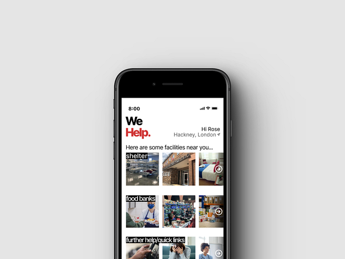
As part of this project, I have designed a platform to host resources to better equip those suffering with homelessness. WeHelp is an online platform that directs your closest local shelters, foodbanks and further care to aid users to rehabilitation.
I had taken the role of a User Researcher and UI Designer.
The problem
Homelessness by definition is the state of not having stable or appropriate housing.
According to homelessness.org, homelessness in the UK is 165% higher than it was in 2010. Covid-19 caused a larger ripple effect with people being put on furlough or unemployment. In this time the government did address the effects and urged a push on providing emergency accommodation for all at risk during the pandemic from March to September.
My projects goal was to create an app that helps tackle the rise in homelessness by empowering them, helping them easily find shelter, food and further care to lead them to complete rehabilitation.
Double Diamond
The strategy used for this design task was the Double Diamond process.

Business Research
Below is a table analysing the following three apps; “StreetLinks”, ”Samaritan — Walk With, Not By” and “Kanndoo — Respondaa”. Doing this will help identify opportunities and threats with creating WeHelp.

Evaluation of research
All these apps came with similar functions
- sending an alert to the charities or organisations
- ability to pin the location of the person
- users are both homeless and not homeless
- clear CTAs and consistent colour themes
- personal profile
- hamburger menu
Negative reviews
- Responda & Streetlink reviews are drastically low to efficiently evaluate
- no longer fully compatible as of lack of updates
- poor user experience
Samaritans User interface
- efficient user journey
- large images
- equal balance of empty and used space
- accessible design
- modern/flat design
Samaritan UPS
- wider user focus
- ability to alert a specific charity
- allows personal connection to the vulnerable
App Store Reviews
Samaritan app has a rating of 4.4, most of them being positive. This is the most positive feedbacked app though with little as 38 ratings. Most reviews talk about it being “easy to use” and effective to do what it’s aimed at.
StreetLink has a large percentage of 1 star reviews, rating as 2.3 out of 5. Feedback mostly talking about the inability to actually use the app and paranoia of the security the app provides with sharing personal data.


User Research
Making an account of primary research was troubling so I heavily relied on outsourcing through articles and charities that speak with and behalf of the vulnerable group. With this I was proved again that a lot of data was hard to source and not recorded, as many suffer in silence or in private.
62% of respondents were hidden homeless on the day they were surveyed and 92% had experienced hidden homelessness (source: The hidden truth about homelessness, 2011)
There is a wide scope of how homelessness can be described, researching the variety allows me to correctly empathetically support the dimensions homelessness may appear.
Below are the 3 different types;
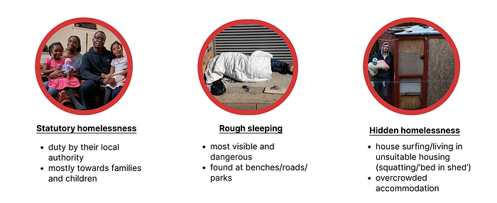
Shelter shows ”at least 271,000 people are recorded as homeless in England, including 123,000 children” (source: https://england.shelter.org.uk/)
The pressures that follow from insufficient housing also effects the access a person would have to healthcare or even education, with these institutions needed an address or from moving finding such places. The continuous movement can hinder them receiving needed care/education, making them even more vulnerable.
The issue on not having suitable and safe housing can lead someone to face many other pressures such as
- deteriorating of mental health
- substance misuse
- lack of continuity in healthcare
- lack of continuity in education
- violence and or abuse for not being in a safe area
I made it important that when designing WeHelp to focus on finding shelter, food and even further quick links that include therapy, counselling, financial help, DA or LGBTQA+ hotlines for the marginalised groups too. This will cover a large amount of different homeless people and will help eradicate the issues and struggles associated.
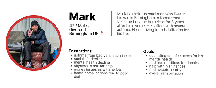
User Persona
Following from my user research, I created a user persona to centre my design as a user-focused solution.
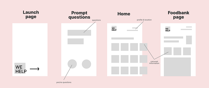
Ideation
Having a mind map allowed me to visualise my work flow. The flowchart shows beginning stages of opening the app right until you have entered all the data needed to view the main pages.

In deciding which design fits best, I did some wireframing. This is normally addressed in 3 parts, low, mid and high wireframing. Each increasing in detail, colour and labelling.
Low-fidelity drawing

Mid-fidelity
High-fidelity
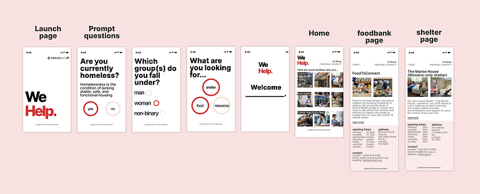
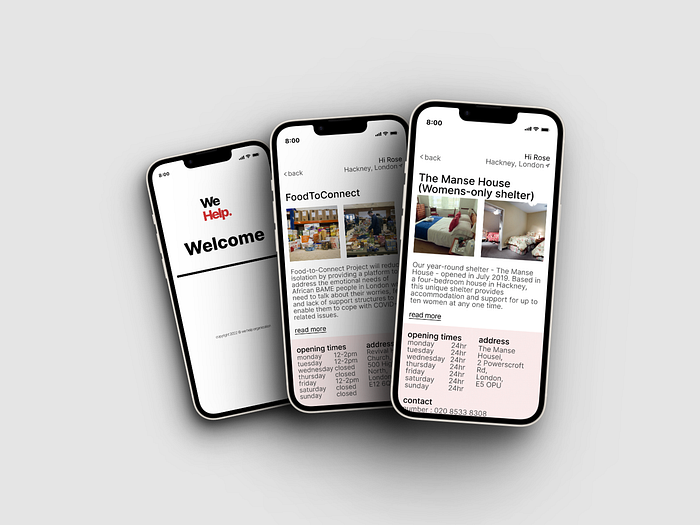
Final Interfaces

Design Guide and Design Laws
Hicks Law
“Hick’s Law states that the more stimuli (or choices) users face, the longer it will take them to make a decision.” This law was reflected upon while in the design stage as I wanted to make sure the user doesn’t feel as if the page is clustered or even make the user frustrated. The first few pages provide isolated journeys, forcing the user to answer questions that take up the entire screen. This is done as the questions would mean each main page will be personalised towards the needs of the user. So if it a women they will be shown women’s only facilities etc.
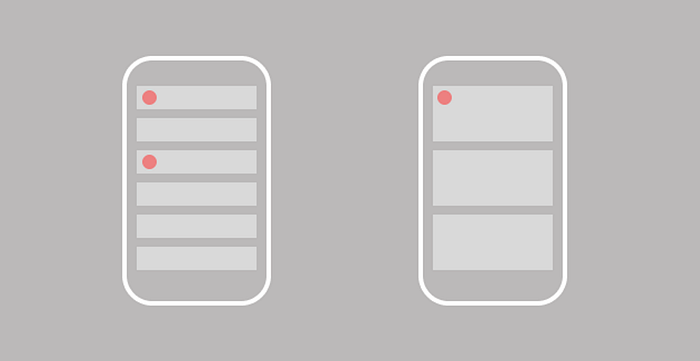
Law of Proximity
The three carousels found on the main page will direct the user to perceive the page in it’s different sections. “The law of proximity describes how the human eye perceives connections between visual elements. Elements that are close to each other are perceived to be related when compared with elements that are separate from each other”. This is further confirmed with the arrow telling the user all the specific information, whether the pantry/shelter/information section further is to be found horizontally and never vertically.
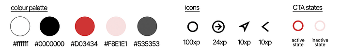
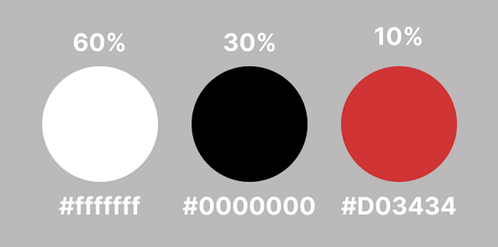
60:30:10
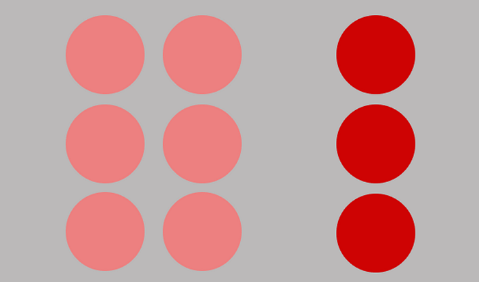
The 60:30:10 rule is a ratio used to help aid a successful colour theme in whatever artistic project someone has going on. It is said that 60 should be the main colour, 30 the secondary and 10 should be an accent colour. As seen in my designs have allocated the 60:30:10 formula with the colours “white:black:red”. Red being the main one as it related to action and courage. Black and white allows the red to stand out, even though it’s the majorly used colours, they are great contrasts and help with creating white space and simplicity with the feel of the app.
WCAG
Web content accessibility guidelines are a set of principles that are to help aid accessible internet for every user. Following from colour, sizing with CTA’s and text, they use a graded system “A” “AA” “AAA” with the last two being passes and triple A being the optimal best. When creating my app I used these guidelines to ensure all people are easily access the application. The figures of with the help of plugins such as “SEE” for a visually imparted insight and “A11y” that colour contrasts all CTAs ad pages. I used a colour contrast checker plugin on Figma to check and further render my designs to the meet the requirements.
Evaluation
From the beginning of the creation of the “We Help” app I was shocked to start this case study struggling to find apps as similar to what I wanted to create. I sadly learnt that there was a severe gap in the market which needed an empathetic heart to enter in, not for personal gain or winnings. In this age very many people have phones, including those who are homeless and Wi-Fi is vastly available in the UK. A cheap smart phone can be picked up from the local shop or they could’ve had it prior to being made homeless. Knowing Samsung’s are cheaper I would love the opportunity to design also for androids OS so it can also be found in the google play store. Doing this would mean greater accessibility for other people to physically get to the app.
I started this design process wanting to make it very inclusive towards as certain group who struggle with homelessness, but further going with research I resulted on creating We Help which is a more simple and widely useable app. If I had more time I would’ve geared my audience towards women, who when stated in my user research tend to have left DA and been forced into homelessness for safety. Similar too the LGBTQA+ who have been made homeless due to their identity. There is a massive gap for these minority groups to be focused on for they both need specific care and facilities to regain independence in a world that doesn’t favour them. Statistics were saying how homeless women also find danger being a rough sleeper as their vulnerability can place them in even more suspectable risks like assault. There are shelters and facilities that exist just for these groups I would have felt even more accomplished being able to amplify their existence and make them easily reachable.
I also would love for this to be easily converted to a browsable webpage as well as an app because if the user is tight on money and is using a cheap phone that is not smart, this app can be restricted from them, or their smart phone may only hold a sufficient amount of space for downloading apps. I wouldn’t want these resources to not be found with haste because I had deliberately made it that way.
Doing this case study allowed me to empathise with homeless people not just as the UX/UR Designer but also as a young adult in the UK who lives in a country where people are one pay check away from homelessness. I would have loved to actually assess this with real users and gather feedback to further improve and let not all the work be in vain. To solve the actual issue as effectively as it can be.
Designing an app not fixated on maximising screen time or selling a product is a juxtaposingthought for a designer when thinking of all other projects I’ve done within design, but the aim for this app is so at some point it will not be used. The eradication of homelessness is the aim.
References
https://www.ncfe.org.uk/all-articles/homelessness-the-causes-and-risks/
https://www.crisis.org.uk/ending-homelessness/about-homelessness/
https://england.shelter.org.uk/media/press_release/at_least_271000_people_are_homeless_in_england_today#:~:text=New research from Shelter shows,England are without a home
https://www.mungos.org/news/women-and-rough-sleeping-report-released/
